Sensitive Documents Dashboard
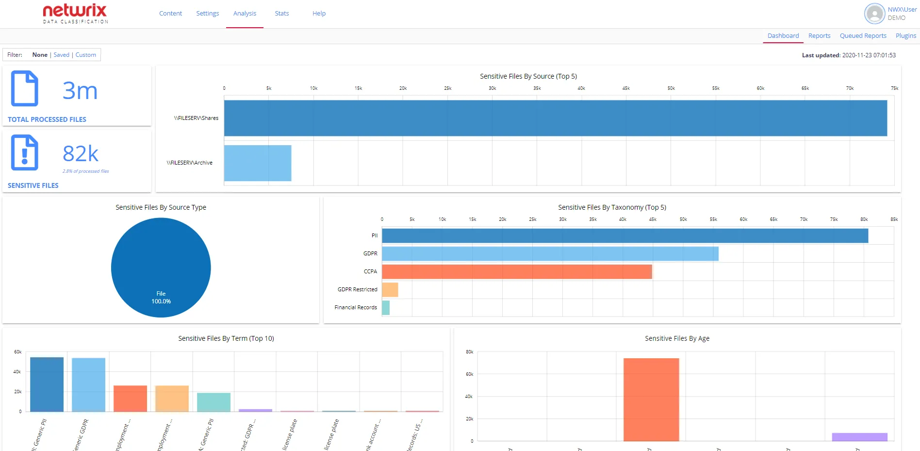
The dashboard provides a top-level overview of the security classifications tagged against the content and lets you view detailed data to identify where your sensitive content is and what it contains. By default, the dashboard shows all classified data. However, you can customize it for your needs. See Customize Dashboard for more information.
To review the dashboard a user requires the Access Reports permission and must have at least one Netwrix built-in taxonomy downloaded. See the following sections for more information:
The dashboard is the home page for the administrative web console.
If you want to switch to the dashboard page after doing any other tasks in the administrative web console, do the following:
-
Click the Netwrix Data Classification logo in the upper left corner.
OR
-
Locate the Data Analysis top level menu and select Reports:

-
Select the Dashboard tab on the left.
IMPORTANT! The data for the dashboard automatically updates every 15 minutes.
Refreshing the page doesn't update the data.
Review Sensitive Documents Dashboard
The dashboard includes the following sections:
-
Total processed files – shows the actual number of the classified files.
noteThe dashboard doesn't count folders.
-
Sensitive Files – helps you identify how many files carry a tag from at least one of the Netwrix built-in sensitive taxonomies except for the following: File Type, File Size, Language. Review the Built-in Taxonomies Overview section for the full list of predefined taxonomies.
noteThe dashboard doesn't count custom taxonomies.
-
Sensitive Files by Source (Top 5) – shows the top 5 sources that contain most of your sensitive data.
-
Sensitive Files by Source Type – shows sensitive content grouped by a source type. This pie chart contains all sources in the environment, instead of the previous one.
-
Sensitive Files by Taxonomy (Top 5) – shows the top 5 taxonomies that contain most of your sensitive data. Use this graph to discover why your data is sensitive. When you hover a taxonomy, the graph shows the number of sensitive files.
-
Sensitive Files by Term (Top 10) – shows the top 10 tagged terms. Use this graph to see what sensitive data you have in more detail. When you hover a term, the graph shows the number of sensitive files.
-
Sensitive Files by Age – this graph is based on the last modified date of a file, and you can use it to see how old your sensitive documents are and how recently files change.
TIP: Clicking any dashboard element opens a new tab with the Sensitive Documents report with the required filters. For example, clicking the Sensitive Files by Age graph opens the report with your sensitive files ordered with the oldest at the top. Use this report to discover where your legacy documents reside. You can also apply filters to narrow the reporting scope.
Customize Dashboard
By default, the dashboard shows all classified data in your environment. However, you can do one of the following to look after the metrics you want:
- Apply filters to view live data instantly and narrow classifications scope at a glance
- Save configurations to quickly access required data
To apply filters
-
Select Custom view in the upper left corner of the dashboard.

-
Select one or more taxonomies and/or one or more source groups you want to see real-time data for.
-
Click Apply Filters to immediately review classified data matching your filtering criteria.
To save configuration
You can build up a few different dashboards for combinations of particular sources you are interested in or particular taxonomies and save this configuration to quickly access required data later.
-
Apply custom filters as described previously.
-
Click Save Configuration.
To review saved configurations
- Switch to Saved view in the upper left corner of the dashboard.
- In the Load Saved Configurations list, select the required configuration.
This loads the latest version of that dashboard.