Data Security Dashboard
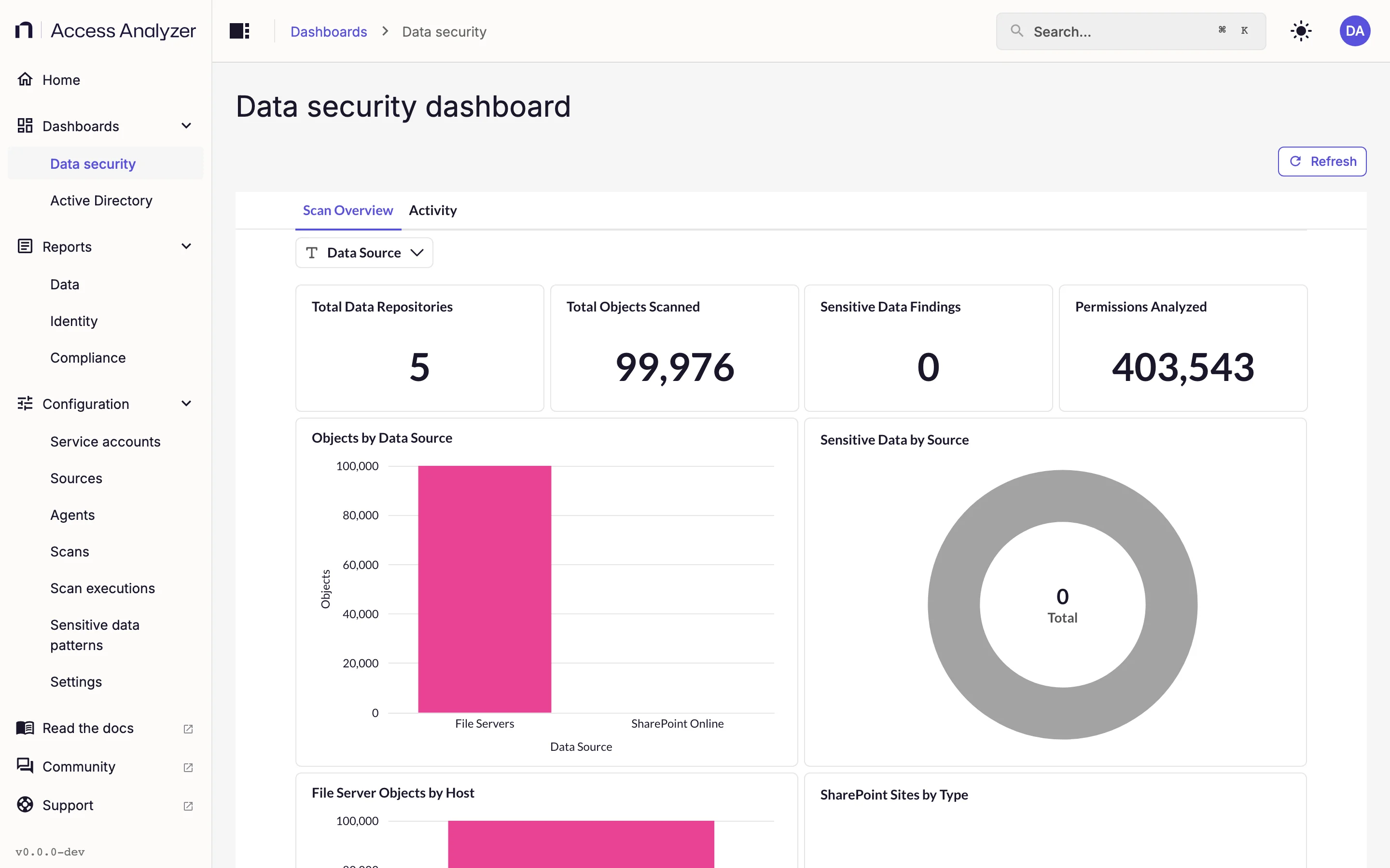
The Data security dashboard is the first place to look after a scan. It pulls every File Server and SharePoint Online source into one view: the number of repositories and objects scanned, the sensitive data findings, and the permissions collected, with a table at the bottom that lists each share and site. A second tab shows access events from Netwrix Activity Monitor.
Open it from Dashboards > Data security. Users with the Admin or Viewer role can see it. Dashboards and reports explains the Refresh button, how to drill into a chart, and how fresh the numbers are.
Data Prerequisites
An Access scan on your File Server and SharePoint Online sources fills the Scan Overview tab. Until a Sensitive data scan has run on those sources as well, Sensitive Data Findings shows 0, Sensitive Data by Source stays empty, and the Sensitive Files and Sensitive Findings columns of Data Source Inventory have nothing to report. The Activity tab holds no scan data at all: it shows events from Netwrix Activity Monitor and stays empty until that connection is in place. Scan types covers the scans; Netwrix Activity Monitor covers the feed.
Tabs and Filters
The dashboard has two tabs, Scan Overview and Activity. Each tab has its own filters, shown above its cards, and every filter applies as soon as you change it.
| Filter | Tab | What it does |
|---|---|---|
| Data Source | Scan Overview | Limits every card except SharePoint Sites by Type to File Servers, SharePoint Online, or both |
| Start Date | Activity | Earliest event time to include |
| End Date | Activity | Latest event time to include |
| Event Type | Activity | One or more event types, drawn from the events Access Analyzer has received |
| Activity Source | Activity | File Servers, SharePoint Online, or Microsoft Copilot |
| User | Activity | One or more users who performed events |
| Event Status | Activity | Success or Failed |
All filters are optional and start empty, which means no restriction.
Scan Overview Tab
The table lists the cards in the order they appear, top to bottom and left to right.
| Card | What it shows | How to read it |
|---|---|---|
| Total Data Repositories | The number of file shares plus SharePoint Online site collections your scans have covered | The breadth of coverage; if you expect 40 shares and see 12, you haven't scanned some sources yet |
| Total Objects Scanned | The number of shares, folders, and files on file servers, plus site collections, sites, document libraries, folders, and files in SharePoint Online, in the latest inventory | Counts each object once, however many runs read it; see Objects and identities. Rises with each newly scanned source |
| Sensitive Data Findings | The total number of pattern matches across both source types | Zero until a Sensitive data scan has run; a single file can contribute several matches |
| Permissions Analyzed | The number of permission entries collected | A rough measure of how much data the permission reports draw on |
| Objects by Data Source | A bar chart comparing object counts for File Servers and SharePoint Online | Shows where the bulk of your data sits |
| Sensitive Data by Source | A pie chart splitting the findings between File Servers and SharePoint Online | Shows which platform carries more sensitive content |
| File Server Objects by Host | A bar chart of object counts per file server | Picks out the largest servers; each bar is one host |
| SharePoint Sites by Type | A pie chart of SharePoint Online sites by site type | The Data Source filter doesn't affect it |
| Data Source Inventory | One row per share or SharePoint Online site, with columns Source Type, Location, Total Objects, Files, Folders, Sensitive Files, and Sensitive Findings | Sorts by total objects, largest first; shows up to 20,000 rows; shares appear as \\host\share paths |
Activity Tab
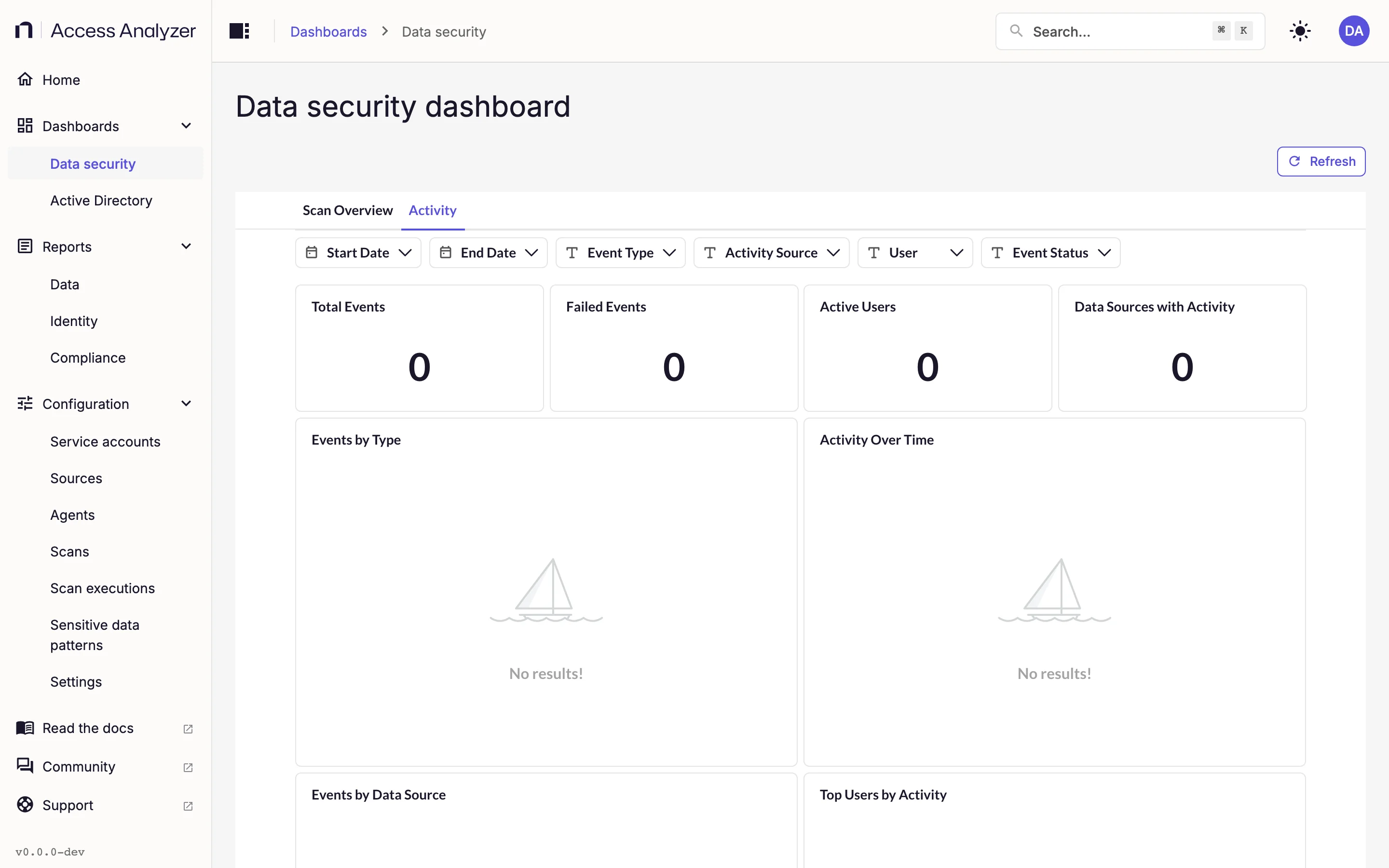
Every card on this tab responds to the six Activity filters. Start Date and End Date bound the time range; the other four narrow the events further.
| Card | What it shows | How to read it |
|---|---|---|
| Total Events | The number of events in the selected range | Your baseline for the period |
| Failed Events | The number of events with status Failed | A spike is worth investigating: check which users and resources the failures cluster on |
| Active Users | The number of distinct users with at least one event | Compare with Total Events to see whether activity is spread out or concentrated |
| Data Sources with Activity | How many of the three activity sources reported events | Shows whether every feed you expect is reporting events |
| Events by Type | A bar chart of event counts per event type | One bar per event type; pick a single type in Event Type to isolate it across the other cards |
| Activity Over Time | A line chart of event counts over the range | Look for bursts outside working hours |
| Events by Data Source | A pie chart of events per activity source | Shows which platform generates most of the traffic |
| Top Users by Activity | A horizontal bar chart of users ranked by event count | The busiest accounts, which are worth checking against their roles |
| Activity Detail | The most recent 500 events, with columns Time, Source, Event Type, User, Resource, Location, and Status | Narrow the filters until fewer than 500 events match, so the table shows all of them |
For a closer look at file server activity, open the Activity Investigation report from Data reports. It filters by user, path, and event type. Group By sets the timeline's unit, day by default.